Quantify Then Qualify: A Simple Framework for Engineering KPIs
by Cody on 2025-12-05 filed under eng

Every technical leader today gets the question: "How are you using AI to move faster?" My 9 year old twins ask me this at breakfast every morning, as they should. It's a great question: it's timely, it's relevant, and if we ignore it, it's *gulp* existential. But before we can answer a question like this, we need a baseline for how our organization is performing. How do we do that?
In this post, I'll share a simple framework for a small-to-medium sized team looking to get started with KPIs. Is it perfect? YES No. It's a starting point, but it's also quantifiable, rigorous, and automatable. Best of all, you can measure all this easily for free. Richer frameworks like DORA are great, but they are hard to get off the ground, especially if you're smaller. Still, this is all the opinion of 1 Random Dude on the Internet™, so take what you like and leave the rest.
Can You Even Measure Software Engineering?
First, a big caveat: plenty of engineering performance is still hard to measure. Some projects are just more difficult and more ambiguous than others. A person fixing 20 little bugs a week might look far more productive than the person who spends 2 weeks on a 5 line change to your homegrown data mapping framework. However, the data mapping framework change might have 100x the impact on performance, correctness, or cost.
Does this mean we shouldn't measure anything and rely entirely on vibes? No! Instead, when it comes to assessing team performance, we should quantify, then qualify. Look at the metrics then put them into context, relying on your judgment and the input of other trusted folks. Metrics don't tell the whole story, nor do vibes. Use the data to start a conversation, not to make knee-jerk decisions on hiring, firing, and architecture.
What Are We Actually Trying to Do Here?

We are trying to capture a simplified view of engineering performance here. It answers these 2 questions:
- Are we efficiently creating software?
- Are we running good systems?
And it tries to answer them with the fewest metrics possible. I aimed for 5.
There's a lot more to a high-performing organization than this simplified view. For example, are we creating the right software for our customers? That's a harder one to measure and might require a Magic 8 Ball. But if we're not shipping any code or we're down all the time, we have much bigger problems, so let's start with the fundamentals.
Commits per week per engineer
How frequently are we committing code each week? We create value through consistent and frequent improvements to the code. More commits are better.
When the average engineer is making frequent commits each week, it's a sign we're making measurable progress on concrete problems. It's also a sign that our codebase is healthy and flexible enough to be changed quickly. If we're not seeing frequent commits, something is wrong and we need to investigate. Our assigned work could be too vague or technically complex, or the codebase is too brittle, or there's a mismatch between expectations and reality.
Measuring this is straightforward. We can hit Github's REST API for repo stats or there are a variety of tools that do just this (I use and like Jellyfish, but there's also LinearB and plenty of others). Note: this metric can be dependent on our git workflow. We care most about merged commits, not every little change committed on an engineer's laptop.
Code reviews per week per engineer

How frequently are we reviewing code each week? We want consistent and frequent code reviews of all those code commits to minimize bugs, customer-facing weirdness, and general bad times. More reviews are better.
When the average engineer is regularly reviewing code and providing helpful feedback, the quality of the codebase improves. Collaboration and shared understanding of the codebase go up. Ideally, every code push gets reviewed and every member of the team is involved in reviews. (We also want these reviews to be useful, and not rubber stamps or full of nitpicks, but that's another post.) If we're not seeing high levels of code reviews, something is wrong and we need to get to the bottom of it. Maybe we aren't confident enough to review the code, or we treat reviews as nice-to-have, or we don't understand the work of teammates well enough to review it.
Measuring this is also straightforward. We can hit Github's REST API for repo reviews or there are plenty of good tools for this (Jellyfish/LinearB/etc).
Automated test coverage
Let's get a tiny bit more nuanced with our KPIs: what percentage of our codebase is covered by automated tests? We want high levels of automation, so we can iterate quickly and confidently. Higher coverage is better.
Test coverage is important because we can ship better software faster when our basic testing process is automated. Humans can only cover so much, while computers are great at quickly and repeatably verifying things still work after changes. Good automated testing also frees up manual test time for areas are are much harder to automate. For example, do we have the right guardrails in place for all these LLM interactions? How do we handle flaky network conditions? The list goes on and on.
We can start with a simple measurement here, then get more sophisticated. First, we track the % of our code that's covered via unit tests and emit this on every run of the build pipeline. We don't need to pay anything for this, every decent language has an open source library for this. Unit tests only tell part of the story though. Our customers (probably) aren't calling our internal code directly. What about integration tests, where we exercise end-to-end usecases? It's harder to measure the % of code covered here because integration tests run out of process. At Seesaw, we ultimately landed on measuring the % of core usecases covered by integration tests. I look at unit test coverage and integration test coverage side-by-side to see where we're actually at.
Availability

Can our customers use our software? Hopefully the answer to this is yes or they won't be our customers for long. Higher availability is better.
If our systems are frequently unavailable, we have a major problem to solve. It's not an optional problem either. When availability is high, our customers can experience the value of our work. That's good! High availability is also a sign that a lot of little things are going right behind the scenes: we're shipping good code, we're managing dependencies well, and we catch small problems before they become big ones.
We could get really complicated with availability reporting, but it doesn't have to be that way. A simple way to start can be 1 - (5xx rate). We can then segment this by region, by team, by client, by feature, etc. Ideally we are pulling these metrics from something upstream of our backend, like client metrics or the CDN in front. Why does that matter? Well, if our backend is down completely, we might not even see the errors on the backend.
Normalized Server Cost

How much does it cost to run our software? Nothing runs for free on the Internet. Lower costs are better.
The cost of server operations is crucial because things get expensive quickly at scale and there are no do-overs when it comes to cost. If we expect our cloud provider bill to be $10,000 and instead it's $10,000,000, it's time to start polishing the resume. Even if we manage to get back to $10k the next month, there's still the matter of that $10M bill. The stakes are high and our server costs are largely within our control. It's a reflection of our technical decisions. If the cost is too high, we can change the architecture to drive those costs down.
We could start simple just by tracking cloud provider costs each month, but I think it's worth getting more complex right off the bat. Often our costs are tied directly to usage. Higher usage is good, but the usage drives higher costs, which is bad. We need to normalize our costs by usage to get a consistent view. A simple way to start is to take our cloud provider bills (and any other vendor spend required to run our systems) and divide by montly active users, or monthly actions, or some other monthly measure of activity. This requires more than 1 data pull each month, but it's worth the effort to get a more informed view.
What's Not Here?
I purposely tried to limit this to 5 metrics and that leaves a lot out, like performance, engagement, and, most important, security. Those are all fundamental but harder to fit into my entirely arbitrary framework of 5 key metrics. The idea isn't that these are the only 5 things we should look at, but 5 to start with then we expand from there.
Sidenote: if you do have a single metric that accurately summarizes your security stance, I would love to hear about it!
How Often Do You Measure?
Let's assume for a moment that we like these metrics. (That's probably a bold assumption.) How often should we track them? Sample size matters here. We want a larger sample size to reduce noise. The more frequently we measure and interpret the metrics, the more we'll get thrown off by randomness. People go on vacation, so productivity slows down for a few days. Our cloud provider has a networking incident, so we appeared offline for 15 minutes. If we are trying to track and account for all of these on a fine-grained basis, we will drive ourselves crazy.
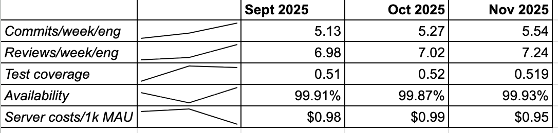
I like to track these on a monthly basis (fictional example seen on the right). Through that, we can establish a baseline and understand month-over-month trends. It also gives us a consistent monthly scorecard for our team.
Summary
Our goal with engineering KPIs is to start simple, establish a baseline, and iterate. Now let's go back to that AI conversation. Next time when my 9 year olds ask, "How are you using AI to move faster?", I can share data, not just hand-wavy anecdotes. KPIs allow us to answer these existential questions with confidence and put those pesky 9 year-olds in their place.